The last 2 classes were the presentations, and it was really interesting to see what people came up with. Some people took a path I would have never went down, like the Application for all your appliances. I also really enjoyed the kitchen appliance that had multiple applications and could be interchanged with other fittings.
I think the Queens project went alright, but could've been better. We all did a really good job doing what we needed to do, but we could've prepared better as a whole. For example, our transitions could've been smoother, and we should have known the order of our parts earlier.Don't judge a book by its cover, but our idea was AWESOME.
Wednesday, June 1, 2011
J10 - Design 200
As a whole, I really enjoyed Design 200. I loved having the blog, and after reading Gabe's explanation of the course, it made a lot more sense. It didn't seem like a hard task by itself, but when assigned multiple times a week it did get tedious, and it taught me I needed to handle and manage my time better. It is something I've always worked on, and it's something I have definitely improved on and probably still can.
I enjoyed the lectures we had and the assignments even more so. It really brought to my attention that everything is designed by someone, somewhere, in some way. It really is interesting, and is definitely something I would like to get into a little bit more.
One thing I regret is not getting my readings done. I don't like to make excuses but my books never came - well, one did, but it was the wrong book, same author. So I was able to do one however it was late and I realize its not exactly acceptable. I do wish I read them for the content and to understand a little better what design is.
All in all I enjoyed this class, and recommend it to anyone that is interested in design. It definitely taught me a lot, and I made some friends on the way.
J09 - Coleman Process Documentation
For this project, us "Queens" didn't know what to do. We started elaborating on the first day of different ideas that we all had. Lights, tents, and kitchen goods were the original thoughts that came about, and one of them ended up being our final idea.
Our first idea was a chandelier that had removable lights. This seemed like a good idea at first, but then we thought it would be too hard to design, so we decided to do something a little more simple -- a stand alone lamp. This was enough for us to get through the first class, so we could start sketching ideas for next class, which is exactly what we did.
The sketch class didn't take too long either, as a lamp doesn't take long to design. We decided to use the original design of removable lights, so we could use the design of having a lantern on top. Since lanterns stand alone and run on battery, we wanted to have the option of having it plugged in, or run on battery.
Since Coleman is for people who love the outdoors, they are environmentally conscious, so we wanted to market a product that would appeal for them. So what we decided to do through our design was to make it collapsible so it could fold into its original package. The best way to make this work was to incorporate a table for a base, so that's exactly what we did.
Since we were designing for a lantern, we wanted our kiosk to follow the same idea, so I spent a night relearning Autodesk Revit, to design and render our idea, while Jay and the others put the finishing touches on our project.
Sunday, May 15, 2011
J07 - Peer Review
Here we are again at the third go around of peer dialog. Again, I reviewed the Queens with how well we've gotten to know each other. Since the last time we did these reviews, we had a journal, an assignment, a reading reflection, and a class reflection. These are the items I will focus on.
I started with Alyson's blog.
http://sbmott33dsgn200blog.blogspot.com/
The first item I looked at was her assignment 4 entry - the letterforms found in nature. I love looking at these because I really enjoyed doing the assignment, so seeing what other people came up with was very enjoyable to me. Alyson definitely had a few that I had never noticed, and probably never would have had she not found them. I think my favorite was the "S" she found using a light bulb. She did a really great job of cropping pictures too, so the letters were very noticeable, like in her first letter "E".
http://sbmott33dsgn200blog.blogspot.com/2011/05/assignment-4.html
Next I reviewed her online scavenger hunt, and she had some great websites that I have not yet been through before which will be extremely beneficial for assignment 5.
http://sbmott33dsgn200blog.blogspot.com/2011/05/journal-6.html
Next for review, I looked over Jay's blog.
http://mazzonedesign200.blogspot.com/
The first thing I jumped too again was assignment 4. His was by far my favorite of the ones I looked at, not just because he had all 26 characters of the alphabet, but because they are all very creative. From lacing in a baseball glove, to the framing in a football helmet, to everyday household products and consumer goods, Jay's alphabet included a little bit of everything. The "B", "G", "I", "K", and "Z" were definitely on the top of my list.
http://mazzonedesign200.blogspot.com/2011/05/a04.html
I continued reading through his blog and the next item of business was his scavenger hunt. He, too, had some ideas for websites and companies I hadn't considered, such as Jeep. All this insight will be very helpful in the near future.
http://mazzonedesign200.blogspot.com/2011/05/j06.html
Lastly, I looked at Sydni's blog.
http://sbeck417.blogspot.com/
She had some great ideas for letterforms in nature, and my two favorite from her included the "R" from a fireplace mantle, and the "W" from window valences. I would have NEVER thought of the curtains as one, but it definitely looked like one after seeing the picture.
http://sbeck417.blogspot.com/2011/04/a04.html
It was nice looking at her online scavenger hunt, because she also included Coleman, who we're currently working for. It was clear the research she did, and it seems she has a pretty good grasp of the idea of the difference between home goods and outdoor goods. She is definitely a crucial part in our research for assignment 5.
http://sbeck417.blogspot.com/2011/05/j06.html
All in all, I am confident that after reviewing my group members' blogs that we have a copious amount of websites and background of indoor and outdoor home goods. This makes me a little less stressed as we'll be able to go to all these different examples for when we start designing.
Monday, May 9, 2011
CR03
In the past couple of classes we had guest speakers come in and speak to us about their experience in Design and what it's like going through school and the process finding a job and also what kind of jobs are available for designers. I found this really neat as they showed us examples of their work, not only from school, but also what they're working on now. It's actually really encouraging to me to see that there is still work for designers (since it's such a broad field) even in this economy. I really liked hearing about the company designed by the students - Cobago. It just shows that even if you can't find work, you can make work. I think just hearing first-hand from past students that it is a good field to be in is really encouraging, knowing that it isn't impossible, and that it's even possible to have a job after graduation.
We have also watched a couple videos in the past couple weeks, one being "RiP: A Remixer's Manifesto". This was very interesting to see, and how copyright laws have been used and abused by companies such as Disney to stop the reproduction of any of their works, or even collaborations or renditions of their works. One example was the preschool that was sued for having non-copyrighted "Mickey Mouse" paintings up. I think it is ridiculous that a day care would be sued for copyright infringement for just painting Disney characters on the walls. I also found it intriguing the process musicians such as Girl Talk have gone through to produce music. I think it's pretty unfair and just shows how greedy corporations and people are in this day and age.
We have also watched a couple videos in the past couple weeks, one being "RiP: A Remixer's Manifesto". This was very interesting to see, and how copyright laws have been used and abused by companies such as Disney to stop the reproduction of any of their works, or even collaborations or renditions of their works. One example was the preschool that was sued for having non-copyrighted "Mickey Mouse" paintings up. I think it is ridiculous that a day care would be sued for copyright infringement for just painting Disney characters on the walls. I also found it intriguing the process musicians such as Girl Talk have gone through to produce music. I think it's pretty unfair and just shows how greedy corporations and people are in this day and age.
J06 - Online Scavenger Hunt
Outdoor Camping and Recreation Products Websites (5):
1. http://www.campingworld.com/
2. http://www.campmor.com/
3. http://marmot.com/
4. http://www.averyoutdoors.com/
5. http://www.gandermountain.com/
Camping/Outdoor Trade Show Images (3):
1.
http://www.canoekayak.com/news/outdoor-retailer-takes-a-cast-at-fly-anglers/
2.
http://www.ksl.com/?nid=148&sid=11770610
3.
http://www.offpistemag.com/blog/template_permalink.asp?id=308
Indoor Home Good Products Websites (5):
1. http://www.sears.com/
2. http://www.ikea.com/
3. http://www.homedepot.com/
4. http://www.geappliances.com/
5. http://www.kirklands.com/
Home/Indoor Trade Show Images (3):
1.
http://flickriver.com/photos/warnersheltersystemslimited/tags/wssl/
2.
http://charlesandhudson.com/kitchens/index.php?page=2
3.
http://charlesandhudson.com/kitchens/products/best-kitchen-and-bath-from-kbis-2011/
What is an indoor home good?
To me, an indoor home good is any product manufactured for the universal use in homes that is designed specifically for a certain function, which is easy to use and accessible. Some examples of "Indoor Home Goods" includes (3):
1. Refrigerator

2. Furniture

3. Lighting Fixtures

1. http://www.campingworld.com/
2. http://www.campmor.com/
3. http://marmot.com/
4. http://www.averyoutdoors.com/
5. http://www.gandermountain.com/
Camping/Outdoor Trade Show Images (3):
1.
http://www.canoekayak.com/news/outdoor-retailer-takes-a-cast-at-fly-anglers/
2.
http://www.ksl.com/?nid=148&sid=11770610
3.
http://www.offpistemag.com/blog/template_permalink.asp?id=308
Indoor Home Good Products Websites (5):
1. http://www.sears.com/
2. http://www.ikea.com/
3. http://www.homedepot.com/
4. http://www.geappliances.com/
5. http://www.kirklands.com/
Home/Indoor Trade Show Images (3):
1.
http://flickriver.com/photos/warnersheltersystemslimited/tags/wssl/
2.
http://charlesandhudson.com/kitchens/index.php?page=2
3.
http://charlesandhudson.com/kitchens/products/best-kitchen-and-bath-from-kbis-2011/
What is an indoor home good?
To me, an indoor home good is any product manufactured for the universal use in homes that is designed specifically for a certain function, which is easy to use and accessible. Some examples of "Indoor Home Goods" includes (3):
1. Refrigerator
2. Furniture
3. Lighting Fixtures
A04 - Letterform Seek and Find

A sidewAlk "A"

Bicycle rack "B"

light Fixture "F"

park bencH "H"

bIg lIght "I"

J-walking "J"

Outside "O"

mirror lake "Q"

stReet light "R"

handrail "T"

Upside-down bike rack "U"

support frame "V"

rain drain "W"

fence "X"

parking spot "Y"
Friday, April 29, 2011
J05 - Peer Review
I decided to stick with reviewing the Queen's blogs since I've done it once already and I am interested to see how far we've come since the first peer review. Since we all now have a fairly good understanding of each other, it'll be easier to read, and I'll know what to look for. The firs blog I reviewed this time around was Alyson's.
http://sbmott33dsgn200blog.blogspot.com/
The first new article on the blog was the scavenger hunt, which all the Queens stuck together for, but we got our own pictures. This was nothing new, since I knew we got them all right! The next piece of business was her second course reflection. I found it interesting that she was very into green design - something I did no know before. I agree with Alyson that more designers should incorporate green design into their projects, as our planet does need all the help it can get.
http://sbmott33dsgn200blog.blogspot.com/2011/04/course-reflection-2.html
Lastly I looked at her found faces, and she definitely had some great ones! A lot involved architecture, which I really appreciated. They were all very clear and concise. Great finds!
http://sbmott33dsgn200blog.blogspot.com/2011/04/journal-4.html
Next, I took a look at Jay's blog.
http://mazzonedesign200.blogspot.com/2011/04/a03.html
I was very intrigued reading reading his second course reflection, as he discussed biomimicry and even used some examples I had not remotely even heard of or even thought of. It was very thought provoking and got me thinking of other designs that are based off of designs that we see in nature.
http://mazzonedesign200.blogspot.com/2011/04/cr02.html
Next I looked at his found faces, and again I was blown away. There were some he had I did not even consider. My favorite has got to be either the ATM with the teeth thats winking, the window lock with the mustache, or the Nintendo plug-in, because I have a Nintendo and didn't even think about using it because I hadn't even seen it. Some very creative stuff right here, real talk.
http://mazzonedesign200.blogspot.com/2011/04/a03.html
Since I was his partner for the scavenger hunt, it was nothing new, as I had taken the photos he "modeled" for.
Lastly, I looked again at Sydni's blog.
http://sbeck417.blogspot.com/
The first thing I took a look at here was her found faces because she had quite a few. My favorite off of her list was definitely either the googley-eyed dresser, or the candle holder. Both very solid, and very creative. After looking at these, I found about 10 more sitting in my room with the ideas I got from Sydni. I definitely feel weird brushing my teeth in the sink with how nicely she portrayed the sink face. I always "saw it" but not like i saw them in her photos. Check out her pictures here:
http://sbeck417.blogspot.com/2011/04/j04.html
After reading her second course reflection blog, I thought about process a lot more. She talked about how she would like to try to implicate the thought process designers go through in creating a design, and applying it to her field of business. I think she definitely has a good idea, and I think this can go back to universal design. I pondered it for a while and thought about how I might even be able to use the same thought process in whatever field I do decide to go into.
http://sbeck417.blogspot.com/2011/04/cr02.html
Lastly, I finished with looking at the scavenger hunt, though it was nothing new as we all saw the same buildings that day.
Sunday, April 24, 2011
J04 - Found Faces
Wow, have I been DYING to do this assignment! In a world where you're iPod is your best friend, and inanimate objects suddenly become personified, I have literally been dreaming about doing an assignment like this. Ever since I was a little kid, I always saw faces places where they shouldn't be - or should be? I also thought I was the only one to see them (that might still be true...) My one regret is that I don't have my camera with me everywhere I go, as it requires a pretty bulky case. However I was able to find many faces, without even leaving my apartment!!
1.

Ta-ta-toaster face, Ta-Toaster Face - My hit song based off Lady Gaga's "Poker Face". Albums dropping soon, just wait...
2.

Now I know this is a pretty common one, but I couldn't pass it up!
3.

Door knob face with screwy-eyes!
4.

Even the lock on the door has a personality!
5.

The subwoofers and amplifier make a face of booming proportions...
6.

Happy Sink!
7.

The bath tub knobs make for a face. I'm always creeped out by it watching me in the shower though...
8.

Googley-eyed robot in my closet! Ahhhh!
9.

The bridge-pins and the saddle on the bridge itself make a nice quirky face.
10.

From the 12th fret all the way down to the sound hole, this universal face can be seen on virtually any guitar. As I took this picture, I realized that in the bigger picture, the dresser and the guitar make one large face! The only sad thing about this picture is the my high E string recently snapped and I don't have any more string at the moment :(

11.

A construction barrel my roommate and I picked up on one [insert adjective describing college here] night.
More to come!!!
CR02
Now I know this is the second course reflection we were supposed to do, and I only have one... Well, ya caught me. And if you didn't, you did now. So to make up for lost time, I will briefly go over my experience in Design 200 over the past FOUR weeks.
In week 1, we were given cards, and we were introduced to the class by the person who owned up to having the same color & suit as you (in this case me) and that person happened to be Sydni B. Although I only got to know her on a pretty shallow level, I soon got to know a lot more about her, and the other queens (Jay M. and Alyson M.), as class chugged along. I also got to know this guy who goes by Gabe Tippery, and he likes to stand in front of the class and act like he knows what he's talking about. Come to think of it, he knows a hell of a lot more than most people ever would about design. I've learned a lot through the first two weeks of lecture, and even more as we finally started to experience design. I realize that all the videos we watch and activities we do, get us really familiar with what design is and how it works.
In the past two weeks, the classes have been a lot more interactive, as we finally covered the premise of what design is in the first two. With that out of the way, it's nice to be able to start to try to think like designers, in terms of universal design and where we actually encounter it. It makes me think a lot more about design and what it is on a much deeper level.
One thing I've noticed that I like about this class, is the blog posts. I love reading other students' blogs and also being able to share my thoughts with my peers. Although skeptical at first, I have definitely warmed up to the idea, as it makes the class very casual and comfortable - like a Barcelona Chair. I'll probably end on a cheesy note like that, because I really don't think it can get any worse...
A03 - Scavenger Hunt
For this assignment, we had to find certain designs on Campus with the given clues. It got us familiar with different designers, different designs, and more familiar with the others who had the same card as us - in this case Jay Mazzone was my partner, and we worked with the other queens Alyson M. and Sydni B. Thankfully enough we had a pretty good idea of what we were looking for, so we went on our way across campus and got the pictures of what was required.
#1. The Barcelona Chair

The Barcelona Chair was a creation of famous designer and architect Ludwig Mies van der Rohe - the same architect who designed the renowned Farnsworth House. This chair was an icon of modernism and was influenced by folding chairs from ancient times. It was first introduced in 1929 at the International Exposition in Barcelona.
#2. A Knowlton Chair

This chair was a Corbusier (Charles-Edouard Jeanneret) design. You can see the shapes that le Corb loved so much (squares) as Jay reads his designer magazine in the over-sized chair. The "Original LC2" is oversized, but the smallest model in the series of chairs that le Corb designed. They are very comfortable and are large enough where it's pretty universal for most people.
#3. A Peter Eisenman Design

Peter Eisenman is a world renowned architect, so the fact that one of his buildings is at the Ohio State University is amazing. His incorporation of the grid system he uses so much, with the 12.5 degrees of separation of the City of Columbus' grid system is absolutely phenomenal. He also included a design of the old Armory that used to sit where the Wexner Center of the Arts currently is.
Here is another picture of the turrets that Eisenman included with his design.

#4. A Philip Johnson Design

Two of the many buildings on Ohio State's campus are designed by Philip Johnson. Johnson is also a worldly architect with designs seen around the globe. As many times I passes the Science and Engineering library, I had never known, or would have never guessed that it was designed by Philip Johnson. I can't say I'm a fan of this particular library, or the Mathematics Towers. They're not as "exciting" as some of his other designs, however it does hold a trait that seems industrial like the PPG Place Building in Pittsburgh, which I find intuitive to mathematics.
#5. Acock & Associates Design

Although I have never heard of the Columbus-based architecture firm, I am quite familiar with one of their renovation projects; the Thompson Library. They completely renovated the old library, and it's evident when looking at the new facade and the book stacks. It's a great building and can be seen from almost anywhere on Campus, as it towers over the Oval.
Monday, April 18, 2011
RR01 - Ch. 1-6
The first chapter of this book was very informative, and did a great job of setting some ground rules that John Heskett would follow for the remainder of the book. Talking about the controversy that comes with the word "design" itself, and it's many meanings. He really does a great job of describing how design means so many more meanings than the one that most people think of. And to consider it in the scientific light where it is not as open ended as in the artistic sense is a whole new way to think about it. He talks about how humans have, relatively speaking, stayed pretty much the same throughout mankind. Minus a few changes, we still all come from the same place, and inhabit the same land. This can likewise be said with design, and how from the beginning of time there has always been a use for designers. It started with the wheel, and moved on to cave paintings and clothing. From there it moved on to houses and machines. And now in this day, design truly encapsulates and consumes every little thing that humans deal with - just as it always has. Just seeing how a true designer views design is a very neat process, and is exciting to read about.
Sunday, April 17, 2011
A02 - Designer Investigation


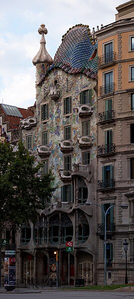
In this investigation, I wanted to get into depth of a few designers that I've found pretty intriguing and interesting. Some of them are pretty well known, some... well, not so much. Although, many of their works are world renowned, many people would never know the name without seeing their works - hate to admit it, but I am one of those people. So with this assignment, I want to familiarize myself, and more people about these designers. I wanted a diverse roster, so I decided on an architect, a photographer, and a rogue artist. I will briefly go over the architect, Antoni Gaudi, and photographer, William Eggleston, and I would like to attempt to go in depth with who I like to call the rogue artist, Mark Jenkins.
Firstly, I will focus my attention on Antoni Gaudi. Antoni Gaudi is responsible for some absolutely remarkable architecture. I had never heard the name until recently when my roommate (who is still an architect major) mentioned him. At first, I didn't recognize the name, however I did recognize some of his works, which is absolutely unmistakable. Now deceased, his works are still seen. He was born in June 25, 1852, and passed on June 10, 1926, at the age of 73, almost 74. From Spain, Gaudi used an immense amount of geometry and volume, many times not even doing drawings, but through models he made himself. He started designing in the neo-gothical age, but ended up being a forefather in the Catalan Modernist movement in the late 19th, early 20th century. His ideas, fluid and geometric, incorporate religion, architecture, his love for Catalonia, and my favorite, his integration of nature into his deign. This can be seen in his works of Casa Batllo. The fluid energy that moves through the structure is absolutely stunning, especially when the story of the building is presented (Saint George conquering a Dragon). An amazing building with an even more amazing story.
His other works include the Roman Catholic chuch known as the Sagrada Familia. This is my favorite work of his, although it is not even close to being completed. After some delay from the Spanish Civil War, progress is slowly being made on this project started over 100 years ago. Hopefully it is completed in this lifetime, as I would love to see his work come to life.
I enjoy looking over Gaudi's works, as they are plentiful. The design he uses is certainly unique, and he even creates a "brand" for himself - something hard to do in a lifetime. I've always been drawn to architecture, so to see everything he has done is mind boggling to me.
http://en.wikipedia.org/wiki/Antoni_Gaud%C3%AD
http://www.casabatllo.es/
http://www.sagradafamilia.cat/
The second designer I decided to review is, as promised, William Eggleston. Eggleston was a rebel, one could argue, using photography as art; color photography nonetheless. He was born on July 27, 1939 and has always had a thing for photo - well, maybe. At the age of 10 he received his first camera (a Brownie Hawkeye), and was quoted saying, "I took some pictures of my dog, but they weren't very good and I was completely disenchanted with the idea of taking pictures." After attending an art school, this opinion he had clearly changed. Eggleston would become one of the first artists to ever use color photos as a form of art, because back in the 1960's it was mainly a form of documentation. Today, however, his work is viewed as art. The classic feel of the mundane life portrays a powerful image. Many of his pictures were dye transfer images which gives them the vintage feel they portray today.
Although at one point his works were frowned upon, today they are widely known. I really enjoy his works, especially those out of the book "The Democratic Forest". Many of his images of still life have been reused by bands, and authors as artwork for album and book covers, for example Bleed American by Jimmy Eat World.
http://en.wikipedia.org/wiki/William_Eggleston
"Chronology" Adam Welch (2008)
"Democratic Forest" William Eggleston (1989)
The last designer I chose was very spur of the moment. From at first not seeing any of his works, or even knowing his name, I immediately fell in love with his art as soon as I StumbledUpon it. And yes, I did in fact find this man via SyumbleUpon. His name is Mark Jenkins, and he does urban installations - mostly of people. Born in Virginia in 1970, Jenkins is still relatively young, and the form of art he performs is even more so. Jenkins is a designer in the field known as "street art". What he does is make clear cast tape models of objects and people, and installs them in the streets of urban settings where they will be seen by everybody who crosses their path, thus making the bystanders subjects in the art. Although illegal, Jenkins argues that it is important for the public to understand that his works are representative of the public itself, raising the controversy it does.
His first work was done in Rio de Janiero in 2003, and since he has carried his creations with him across the world, creating new installments wherever he travels. One of his most popular pieces is "Call Waiting" in Washington, DC.
This is the very tip of the iceberg when looking at the works he has done. In 2005 he did a project called the "Storker Project" where he placed his infamous tape castings in the form of babies all around the world in various locations and scenes. On the streets, to statues, to trees, to even billboards, his babies were seen everywhere.
http://www.xmarkjenkinsx.com/storker.html
I find this idea very provoking in the sense of the controversy that it raises, and the fact that Jenkins is one of the first artists to ever do something such as this. Installations are unique, generally speaking, and these are even more with how public they are. Most figures are generally face down, or have at least some sort of hood up, as he does not concentrate on the facial features of his subjects.
I just love the freshness that comes along with his work. Being that street art has never been done in this sense, it's cool to see a new style of art being created in this generation and in this day and age. It's refreshing to see that originality is certainly not dead.
http://en.wikipedia.org/wiki/Mark_Jenkins
http://www.xmarkjenkinsx.com/
http://www.jungle-life.com/?itemid=1132
J03 - Peer Review
Prior to meeting all the members of the Queen community (Sydni B., Jay M., and Alyson M.), I had only interacted with Sydni Beck, who has the same suit as me - she is a heart, I am a diamond. So naturally, I took a look at her blog first to see any information I hadn't already found out, and to see the work she had done. At first glance, I noticed the fluid writing skills she has that she failed to mention. Her posts are lengthy and in depth providing critical information on whichever subject she is presenting. I enjoyed looking at the patterns she chose for Journal 2. Simplistic, yet intricate, each design she chose can be seen everyday, walking through neighborhoods. It really got me to thinking about how everything we see, everything we interact with, and everything that encapsulates us as human beings was designed by a designer, either interior, graphic, or industrial.
http://sbeck417.blogspot.com/2011/04/j02.html
After reading the artists she reviewed, it is apparent that she is most definitely an Apple person, considering her first 2 artists were Apple associated, and one of her cites even includes a link to an Apple fan-site which I imagine is bookmarked on her computer - Apple. I have never been an Apple owner, however after reading about how her family as a collective has owned almost every Apple product, there must be some reason to the madness, and maybe I should seriously consider diving into the Apple market, as many Americans have.
http://sbeck417.blogspot.com/2011/04/a02.html
The next blog I took on was Jay Mazzone's. I briefly met Jay on Thursday, however wasn't really able to find out too much about him, other than that he is from Cleveland (as is Sydni) and is also the only other guy in the community that makes up the Queen population. Thus said, I was interested in reading his blog, and seeing his thoughts and to get to know him a little bit better. Turns out, he is also a Marketing major minoring in Design, which is what Sydni is, and what I would also like to be upon graduating. His inspiration is very neat - becoming a logo designer for professional sports teams. This can clearly be seen through his artist review, where he reviews a renowned sports logo specialist, Todd Radom, and a golf course designer, Tom Weiskopf.
http://mazzonedesign200.blogspot.com/2011/04/a02.html
It's easy to see that sports are a huge part of Jay's life. He likes baseball and all sports, wants to design for professional sports teams, hell, he even works on a golf course, and he (which I found really intriguing) is not only in the Ohio State University Sports and Wellness Scholars, but even took a kayaking trip to the Everglades with the Outdoor Adventure Center at Ohio State. I really like that he is so passionate about sports and the outdoors, which is definitely a trend I have seen from "Clevelanders". I definitely enjoyed reviewing Jay's blog, to see where he is, how he got here, and where he is headed. With the inspiration he shows it's hard to imagine him not doing something in the field of sports.
http://mazzonedesign200.blogspot.com/
Last, but certainly not least, is Alyson Mott's blog. Although I have never met her before, it seems like I've known her for ages after reading her blog. Like Jay, she is definitely very passionate about sports, seeing how she is on the Ohio State University's softball team! I think that is absolutely awesome, and so cool. To be able to wear a varsity letter from a Big 10 school is such a big deal. Especially on a team that she grew up around, and her parents love, that just must be the greatest feeling. Turns out she transferred from Capital University (like the man Gabe, himself) where she started as a freshman. AS A FRESHMAN. That is really impressive, so she certainly has a knack going for her. The fact that she is majoring in Interior Space Design, certainly not an easy major, makes her that much cooler.
http://sbmott33dsgn200blog.blogspot.com/2011/03/assignment-1.html
As I scrolled up the page to get to hopefully know her a little bit better, I see the patterns she chose, and each one definitely caught my eye. They were certainly all patterns, and very interesting ones at that. Mostly nature oriented (which I really enjoyed), and close to home, if you will. It made me realize that we don't have to even go but two steps out the door before patterns start appearing. Her thoughts were very insightful, and I really enjoyed the depth and color in which her photos included. I'm glad she pulled a Queen as I look forward to getting to know her more.
http://sbmott33dsgn200blog.blogspot.com/2011/04/journal-2.html
Monday, April 11, 2011
J02 - Patterns In Life
In this assignment we had to find patterns that appear in our everyday lives and document them. It was never really anything I thought about even though I see them every single day. Although I wanted to capture every one possible, I narrowed it down to my favorites, and due to a sub-par camera, it was hard to encapsulate the exact idea I was going for. So, without further adieu, here is a link to my Photobucket page where the pictures are posted, with descriptions of each.
Sunday, April 3, 2011
Introduction! (A01/J01)
Hey Everybody! (Or to all who reads this),
My name is Tyler Burkert. I am 19 years old and have spent the last 19 years of my life in Ohio. Pretty exciting, right? Cincinnati to be exact. I have been at Ohio State for two years now, making me a sophomore. I started my college experience in Scholars Architecture and lived in Baker West my freshman year. After a change in plans, I am no longer in Architecture, instead I am figuring out what I really want to do for the rest of my life. I've recently decided I want to maybe give Marketing, Design, or some form of Communication a try. Why you ask? Well, I love to draw and I love dealing with people and designing things for people, so these options are pretty viable right now. If anyone wants to comment on the Marketing/Design/Communication route, please do. I really want to hear what people are saying about the majors, and how they feel about them.
I've loved to draw ever since I was a little kid. I still do to this day. The walls in my apartment are covered in chalk (as you can tell from my profile picture) so if you're like me, you understand how much fun it really is. That is what life's about right, having fun? I like to think so. That's probably why my main source of income (job) includes dressing up in ridiculous costumes at a theme park and dancing with people and kids all day. I can't think of a job that I'd rather do. Maybe to become a tattoo artist, because it would let me show my creativity (or lack thereof) to many. I recently got a tattoo, one I designed myself. I've drawn up tattoos for some of my friends too, and I really enjoy seeing the art move from one medium to the other. It's almost like the art comes to life, and that's something I really enjoy seeing, even if it isn't my own.
A lot of what I draw and the designs I do come from music, which I consider another huge part in my life. I believe that music very much defines who I am, as there is a genre of music for every mood I'm in. It's just another form of art and considering I love art, music is one of my favorite forms to experience.
So in all, I guess I'm just looking to take away a little bit of everything from Design 200. I want to learn what design is, what types of designs are out there, and how to implement what I want to do in Design, or implement what I learn in Design to what I want to do. I'm hoping that this course will help me make my ultimate decision in what I want to do for the rest of my life (what a scary thought. . .) even if it is something I'm not even considering at this point. I'll cross that road when I come to it, so for now I'm going to enjoy the experience and take everything from this class that I can.
Subscribe to:
Comments (Atom)